Section start heading two
This is the big para style, which makes big paragraphs. It can be used in combination with bold, centred, and blue text, to make big intro paragraphs. It would mainly be used as introductory paragraphs or for emphasis within page content.
Everything from here down to the full-width divider line has been added into a standard editable text panel.
All panels have been given margin and paddings settings of “small”. Panels have a “settings” tab where margins, paddings, background colours and other things can be adjusted.
Heading two
Note that as well as the standard Heading two you can also have a “section start Heading two” which is larger, and is particularly intended for use at the beginning of a section. To do this, make a heading two in the normal way, then apply the style “Section title h2” from the drop down Formats menu.
Heading three
Heading four
Heading five
Heading two
This shows the spacing after the heading two before the paragraph text. Ut enim ad minim veniam, quis nostrud exercitation ullamco laboris nisi ut aliquip ex ea commodo consequat.
Heading three
This shows the spacing after the heading three before the paragraph text. Ut enim ad minim veniam, quis nostrud exercitation ullamco laboris nisi ut aliquip ex ea commodo consequat.
Heading four
This shows the spacing after the heading four before the paragraph text. Ut enim ad minim veniam, quis nostrud exercitation ullamco laboris nisi ut aliquip ex ea commodo consequat.
Heading five
This shows the spacing after the heading five before the paragraph text.Ut enim ad minim veniam, quis nostrud exercitation ullamco laboris nisi ut aliquip ex ea commodo consequat.
Please note, you should never use “Heading one” inside content panels – it should only be used for the page title.
Here’s a standard paragraph. Lorem ipsum dolor sit amet, bold consectetur adipiscing elit, italic sed do eiusmod link tempor incididunt ut labore et dolore magna aliqua. Ut enim ad minim veniam, quis nostrud exercitation ullamco laboris nisi ut aliquip ex ea commodo consequat. Duis aute irure dolor in reprehenderit in voluptate velit esse cillum dolore eu fugiat nulla pariatur. Excepteur sint occaecat cupidatat non proident, sunt in culpa qui officia deserunt mollit anim id est laborum.
The formats tab can be used to style text as follows; pink text, navy text. You can also have white text if you need it.
- Bullets ut enim ad minim veniam, quis nostrud exercitation ullamco laboris nisi ut aliquip ex ea commodo consequat.
- Duis aute irure dolor in reprehenderit in voluptate velit esse cillum dolore eu fugiat nulla pariatur.
- Excepteur sint occaecat cupidatat non proident, sunt in culpa qui officia deserunt mollit anim id est laborum.
- Duis aute irure dolor in reprehenderit in voluptate velit esse cillum dolore eu fugiat nulla pariatur.
- Excepteur sint occaecat cupidatat non proident, sunt in culpa qui officia deserunt mollit anim id est laborum.
- Numbered list ut enim ad minim veniam, quis nostrud exercitation ullamco laboris nisi ut aliquip ex ea commodo consequat.
- Duis aute irure dolor in reprehenderit in voluptate velit esse cillum dolore eu fugiat nulla pariatur.
- Duis aute irure dolor in reprehenderit in voluptate velit esse cillum dolore eu fugiat nulla pariatur.
- Excepteur sint occaecat cupidatat non proident, sunt in culpa qui officia deserunt mollit anim id est laborum.
- Excepteur sint occaecat cupidatat non proident, sunt in culpa qui officia deserunt mollit anim id est laborum.
This paragraph is formatted as a a quote using the wysiwyg “quote” button. Please note that there is a special Quote panel for making more fancy quotes.
Another standard paragraph, immediately before a horizontal line that was added inside an editable text panel. Note that although you can eadd them inside the wysiwyg editor, there is also a separate panel for nicer dividers, which will be shown lower down this page.
Another standard paragraph, after the horizontal line.
This is the last paragraph in the editable text panel. It will be followed by a divider panel, a quote panel, and then an image, and then other panels. Divider panels have 3 different style options – this one is the “extra thin” version.
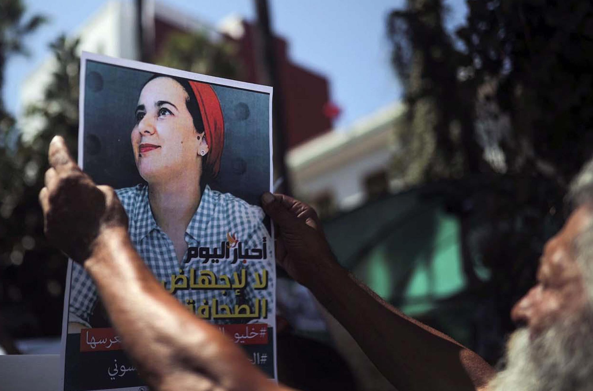
Quote panel. Many Polish schools do not offer formal sex education, instead teaching students how to “prepare for family life”.
Reference goes here
The video panel above has its background colour set to navy. This text is in a standard editable text panel, also with background set to navy. Margins and paddings have been adjusted to make the two panels look as if they are one panel. Also, this text has been set to White using the Formats dropdown in the wysiwyg. You could use this approach with a wide range of different panels, for example with an image instead of the video panel. The background doesn’t have to be blue!
Organisation list
Example with circular logo. This Organisation list panel is particularly intended for use in the Regional membership section.
Organisation list item
Example with tall thin logo. Quam id consectetur adipiscing bibendum suspendisse faucibus a pellentesque dignissim enim et netus. Tellus in metus vulputate eu sem integer quis imperdiet proin nibh lacus vestibulum.
Special link
Organisation list item
Example with short wide logo. Quam id consectetur adipiscing bibendum suspendisse faucibus a pellentesque dignissim enim et netus. Tellus in metus vulputate eu sem integer quis imperdiet proin nibh lacus vestibulum.
Below are examples of link cards panels, showing the 2 and 3 column variants. Please take care not to add too much text into them.

Link cards can be 2 up (see above) or 3 up (see below).
Above is another divider panel, this time the “standard” version.
Below is an example of the Link block panel.
Link block: Excepteur sint occaecat
Excepteur sint occaecat cupidatat non proident, sunt in culpa qui officia deserunt mollit anim id est laborum.
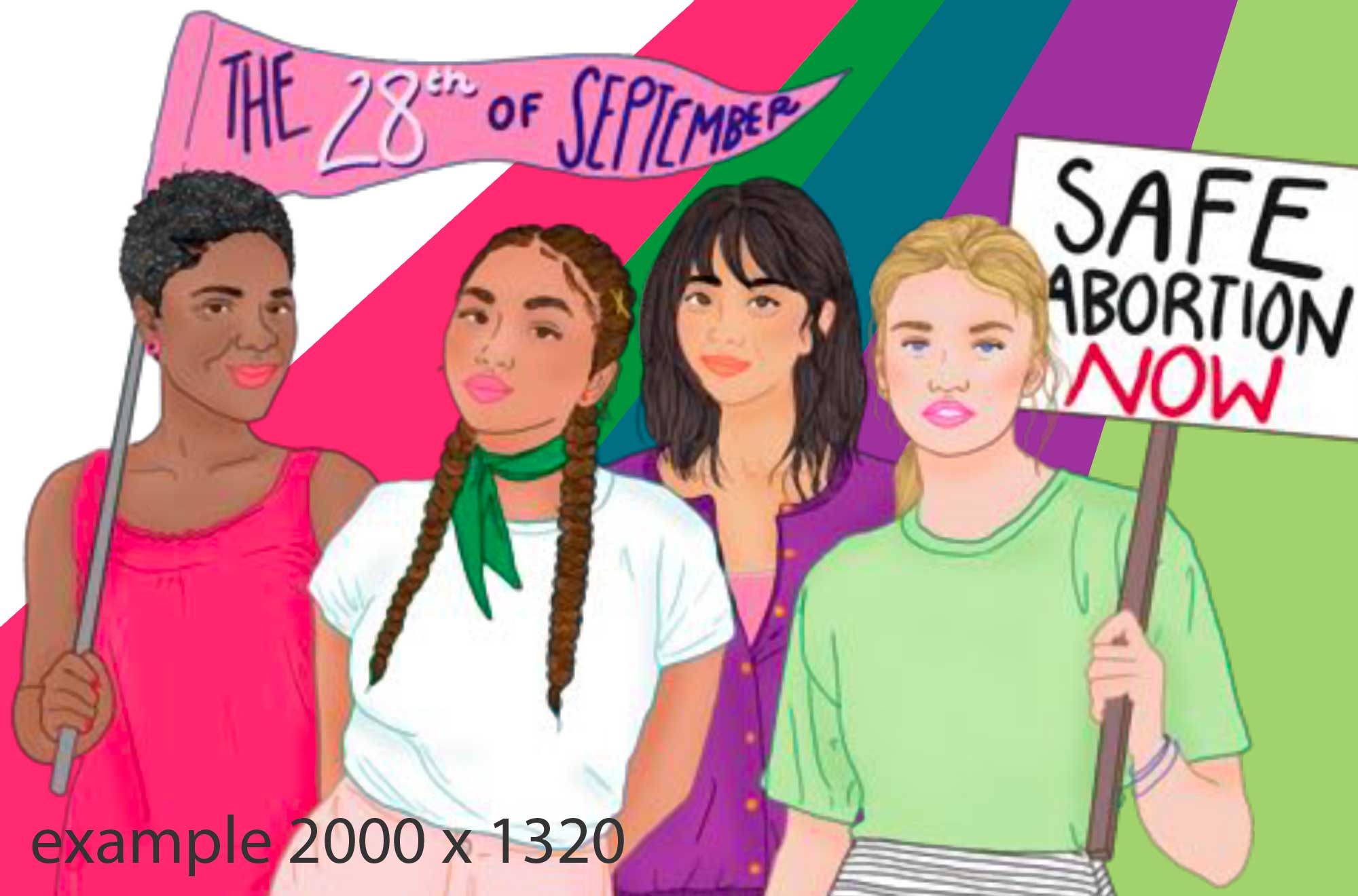
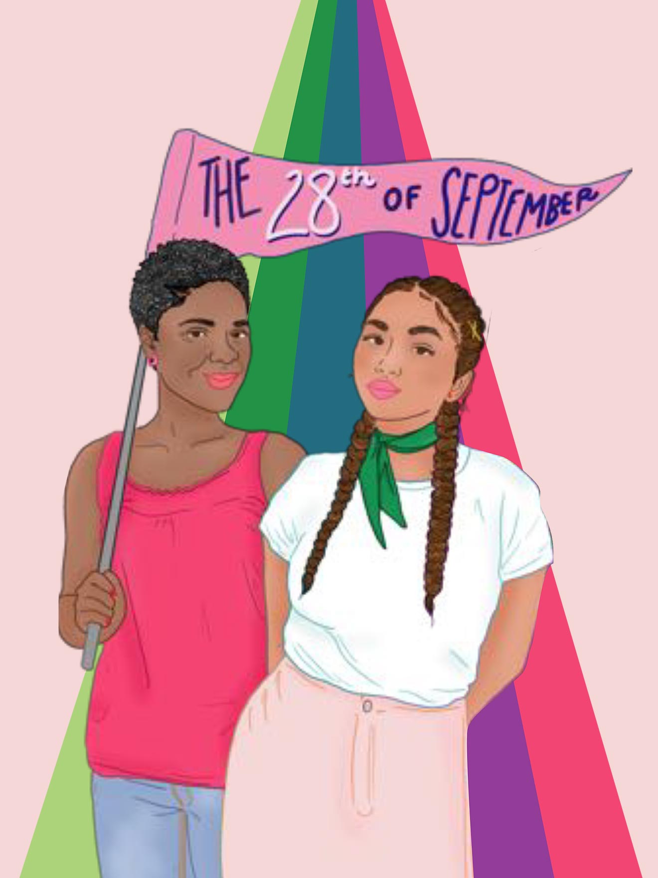
Solidarity Requests 2020
Open letter to UN Secretary-General António Guterres, Heads of UN Agencies & national leaders RE: International Safe Abortion Day, 28 September 2019
Duis aute irure dolor in reprehenderit in voluptate velit esse cillum dolore eu fugiat nulla pariatur.
Join the campaign Campaign StatementsBelow is a Resource cards panel. it is followed by Feature panel, then CTA Wide panel, and then a Quote panel.

Example: Medical management of abortion report
Excerpt text for "Test Medical management of abortion".
Read more about Example: Medical management of abortion report Download
Example: Video of an abortion rights demonstration at the Helsinki Summit
This is the excerpt text for Video of an abortion rights demonstration at the Helsinki Summit
Read more about Example: Video of an abortion rights demonstration at the Helsinki Summit
This is a “featured” panel. It has the image on the left, at 33% of the panel width. It also has a link button. The background colour is “Blue ice”. It has the “big para” style added to make the text bigger for the larger line length.
Second Feature Panel example
Another “featured” panel, this time with the image on the right, at 50% of the panel width. It has no link button, but it does have a heading. It has a pink background with optional icon, and text set to white. You can write as much text here as you need to. The content is fixed to align to the top of the image.
CTA Wide example
Note that by setting bottom margin to "none" you can make panels with coloured backgrounds bump into each other, without a white gap in between, as shown above.
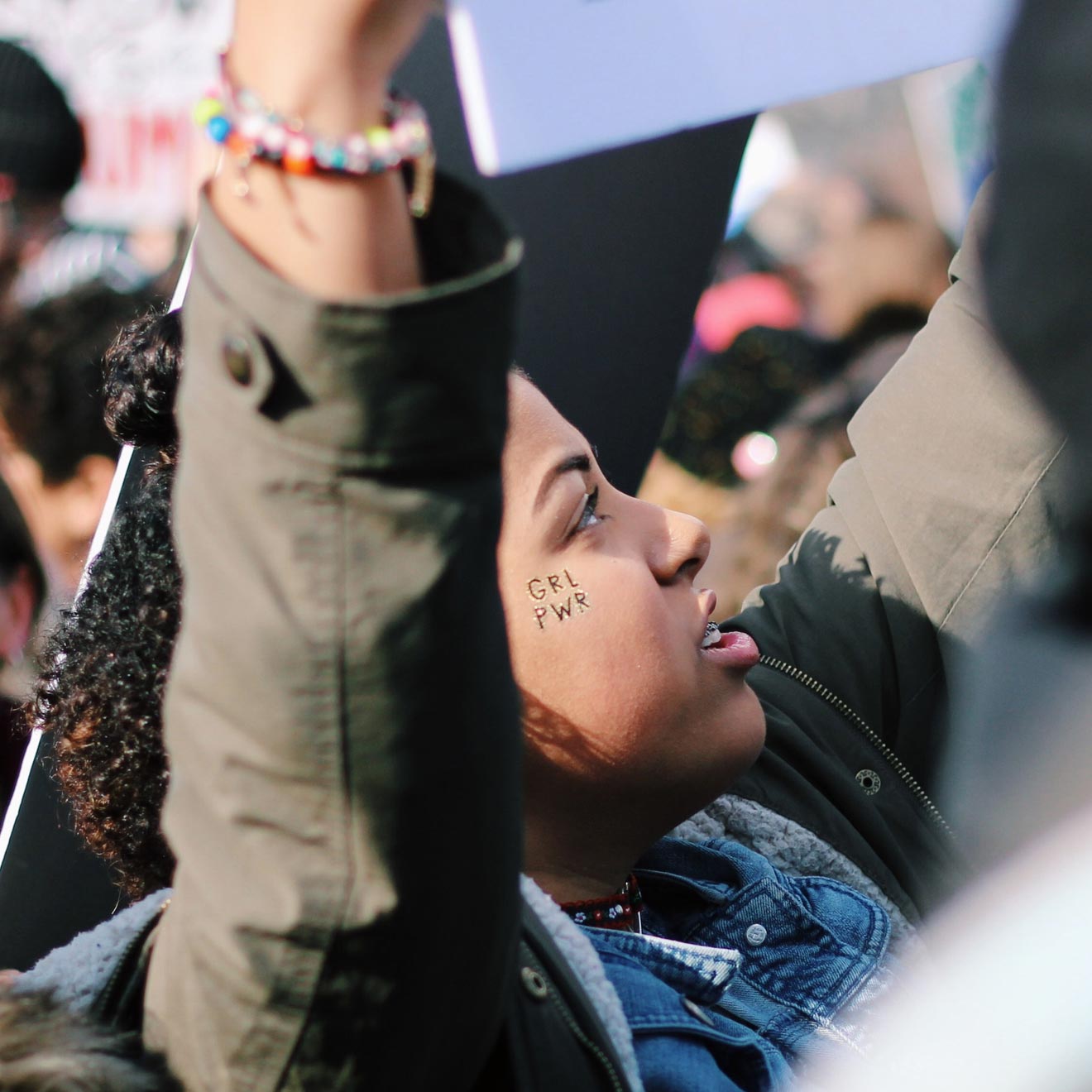
Image gallery
Here’s an image gallery. You simply add the embed code from Envira Gallery into an editable text field, like this.
I have added a random selection of images from the media library, to show how the gallery attempts to slot the images together. For best results you should use images with the same dimensions.
I’ve selected standard width for this panel of copy, and ‘medium width’ for the gallery in a separate editable text panel to allow more space for the images. It could also be set to wide or standard, like all editable text panels.
My gallery title


That’s the end of the main content panel examples. Below you can see examples of Pre-footer ready-made panels.
